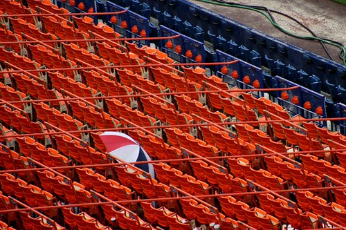
Blue is, as one of the original crayon colors, perhaps not as flashy as some of the newer additions. But it’s a classic, and I was surprised at how much true blue I found in my archives. I just love the richness of a real royal blue, maybe because you don’t find it too often. I just couldn’t leave any of these out, especially since the last one is from Shea Stadium back in 2006.
Category Archives: photo projects
A Picture a Day for a Year. Again!
So today I finished my third year of Project 365, and it is SO exciting. It’s been a mostly awesome year (with a few stumbles along the way), and finishing the project on such a high note is a definite plus. But it’s always fun to go back through the year, and I wanted to share some of my favorite photos from the past year.
Orange
Orange is and has almost always been my one true favorite color. I flirt with other favorite colors but when it comes down to it? I’m all about orange. Which is why I was surprised not only at how few photos I found in my archives last week when orange came up for sixty-four colors, but also how it wasn’t really jumping out at me in the wild. I still love every one of these shots, though, and think they make a pretty nice set together. (Also, as I’m looking back at what I got during red orange week, that explains why I couldn’t find as many true orange shots in the archives!)
Brown
Oh, brown. You don’t have a fancy-sounding name as so many of the other crayons, and you’re tricky to photograph just like the purples. Way back when we did sepia and I compared it to brown, I intended to post a shot of the color of my hair for this week’s shot.. but when it came down to it I just… didn’t. So you’ll just have to trust me that this mug is perfectly brown in person.
White
White was this week’s color for sixty-four colors, and admittedly, I was a little hesitant at the beginning of the week. It took an impromptu trip to the boardwalk in Asbury Park to spark my creative juices, but then, I always love taking pictures there. (Although I’m beginning to fear that I’ll soon reach the limit and have taken pictures of everything interesting there… but let’s not get ahead of ourselves.) And then I found so many cool shots for white in my archives that I couldn’t limit it to just a few. Or maybe the shots of snowy winters are especially charming just because it’s the middle of August.
Sky Blue
Sky blue was a fun one, and not just because the crayon isn’t as much like the color of the actual sky as you’d expect. Some of the archive shots are film ones, which fits in neatly with my recent obsession with film, too.
Goldenrod
Goldenrod is a funny color, because the crayon itself looks all boring and drab and dull… but then you color with it and it’s one of the cheeriest yellows out there. And yellow is one of my favorite colors to look for in the wild, even better that I already had sunflowers sitting on my dining room table when I found out this week’s color. It’s just happy, heart of the summer stuff. Which is always, always a good thing.
Plum
I was awfully excited while I was in New York City a few weekends ago, because I got a secret sneak preview of the week’s color because I was, you know, standing next to Jodi as she took her photo of the plum-colored door in Soho. I was also a bit reluctant, because the purple crayon weeks in sixty-four colors can be frustrating, especially when it comes to getting a photo that looks on the internet like it does in real life. And thenĀ I found several instances of plum in real life during our birthday adventures after all. Shows you how much I know!
Red Orange
I know I’ve been a bit lax lately in posting photos from the archives for each week’s color in sixty-four colors, but mostly, I didn’t think I’d find much in the archives that matched cadet blue, and I’m pretty sure I’ve already matched my magenta-ish pinks to other crayons, even though they also sort of match wild strawberry. But then along comes red orange, and I think red orange might be my favorite color in the universe. I love orange, but the deeper, almost reddish orange of red orange is the exact SHADE of orange that I happen to prefer. So there’s a lot of goodness in the archives in this color. The first two were taken this week, and the others are older shots.
Tumbleweed
The brown/tan crayons are some of the colors I’m most nervous about in the sixty-four colors project. I’m not sure why, because they are some of the more prevalent colors. Maybe because they aren’t always the prettiest subjects for photos? I don’t know, but last week was one of the more DUH moments in this project, as I had this funny sense that I’d seen some bricks in the exact shade of khaki to match tumbleweed, but I couldn’t figure out where I’d seen them. Until I realized that I LIVE in a tumbleweed-bricked building, and have for three years. Wow.