Yellow Green is the perfect color to be looking for as spring is just approaching full force. And it’s a very vivid one if you get it in the right light.


Yellow Green is the perfect color to be looking for as spring is just approaching full force. And it’s a very vivid one if you get it in the right light.
Last week’s color for the sixty-four colors project was peach. And it was tough. (Maybe I made it more difficult because I didn’t want to go with flowers.) I don’t have a single peach-colored thing in my apartment, but I found some in an unexpected location at my parents’ house. The others are some happy photos from the archives.


The color last week for sixty-four colors was asparagus, and I won’t lie, I had a little trouble with this one. I have a very strong image in my mind of what asparagus looks like, and I just wasn’t seeing it, not until I noticed some of the mold growing on my grandmother’s deck. Is that weird, posting a photo of mold? Well, it’s just the right shade, so I’m going with it. The other shots are from the archive, and they seem like a decent match. This is one color that it’s very easy to be super nitpicky with, so I’m not 100% satisfied. But they are all definitely in the asparagus family, so there you go. (Man, do I love this project.)


Last week’s color for sixty-four colors was robin’s egg blue (another 1993 addition; I guess 1993 was a big year for new colors!). This is one of my favorite colors lately, or as close to the turquoisey aqua that is so cool. The color of the crayon is a tough one to match, but I managed to find it in a few places last week. I found a lot of robin’s egg blue in my archives, and you KNOW I’ve been waiting to go back to some Bermuda shots for this project since it started.


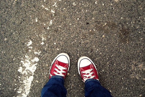
Brick red has always been one of my favorite crayons. I was surprised, though, that all of the bricks I encountered this week weren’t quite brick red-y enough. The first two are shots I got this week; the rest are just some favorites.


Apparently I can’t resist a photo project where color is the focus. For the LOVE of COLOR week just ended, and I have had so very much fun looking for the brightest colors (spring green, fuchsia, orange, yellow, royal blue, purple, and bright red). Spring seems to finally be close, and this week of super saturated, cheery colors has gotten my mind even more primed for some springtimey goodness.


This week’s color for the sixty four colors project was timberwolf, a gray crayon that I definitely don’t remember from my many childhood days spent coloring. After looking at the super fun Crayola timeline, I discovered that timberwolf was added in 1993. So even though that may have been still firmly in my coloring heydays, I’m almost positive that my little plastic briefcase of 96 crayons had been mine for quite some time. AKA, I didn’t need new crayons after 1993 and probably never had a timberwolf one.
Anyway! It’s a very pale gray, and it felt like the whole world was timberwolf this past week. So it was fitting as we wind down the end of winter.


Macaroni and cheese was an interesting color this week for sixty-four colors. It’s a very warm yellowy orange. And a lot of my hesitance was more about the fact that this color definitely didn’t exist when I was a kid. But I love that they let kids vote on the names for the new colors, and I’m sure as a kid this would have been groundbreaking stuff. In the end, I only found one new shot for this color last week, but I found some pretty good matches in the archives (and from that trip to the beach on Presidents Day!).


Blue violet is one of my favorite crayons. It’s purple enough to be pretty, but blue enough to not be quite so, well, PURPLE. It was harder to find in real life, perhaps because I wanted to get it perfect. And trust me, these two photos from the Gap are not perfect, but in real life, they were precisely blue violet. And then you’ve got some flowers because purple flowers are pretty nice.


Pacific Blue was this week’s crayon for sixty-four colors, and it proved to be a little tricky. Or, I’m a perfectionist. I only found/staged one shot that I think counts this week, but that’s one of the reasons I like having a set for it; I can always add future shots and continue to be just as perfectionisty as I like. I did find a few in the archives that seem just about right.


