
With just under a year and a half of Project Life under my belt, it wasn’t even a question that I’d keep it going in 2014. I’m sure, like every thing else, I’ll have to reimagine how I approach it once this baby arrives, but for now, full steam ahead.
I haven’t changed much about my approach for 2014, other than adding some new supplies. I’m now subscribing to the Studio Calico Project Life monthly kit, and definitely enjoyed my January kit. (Especially since I’m not normally much of an embellisher; having embellishments that not only coordinate with cards but are fun/cute has been an interesting adventure so far.) I now have three core kits: Seafoam, Honey, and Midnight. I’m especially obsessed with Midnight, which I’ve only been using since this year began, and am loving the simple, clean lines. I also bought Ali Edwards’s weekly title card overlays. Last year, I just used Photoshop to add text with the week number to a photo, but I’m loving how these overlays look so far this year.
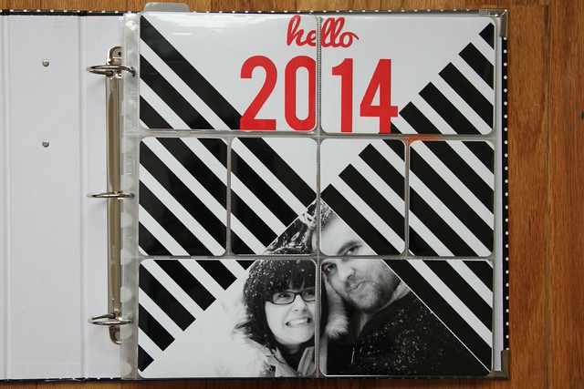
I wanted to go simple but bold with this year’s title page, and I was super inspired by the triangles featured in both Elise Blaha’s 2014 title page and Trish Harrison’s 2014 title page. I probably could have used a template, but instead I created this in Photoshop myself, painstakingly dragging black rectangles around the canvas, erasing corners of my photo… even though it took over an hour and I nearly went cross-eyed in accomplishing it (self taught isn’t always the best way…), I just love how it turned out. Stripes, black and white, me being weird and Dan being awesome. It’s perfect.


Week one was a short week, so I was glad to have such fun cards from Studio Calico to fill in the spots. I also used part of Elise Blaha’s 2014 photo calendar for the monthly calendar card on the left side. I tend to fill my 3×4 slots with journaling cards and photos, so when I’m planning my pages, I have to make a concentrated effort to leave space for “filler” cards or I’ll never end up using them. So far I’m liking it. (I also included the feather from one of Luna’s toys, since I had the photo of her with said toy, and the toy only lasted two days before she ripped the feather completely off anyway.) (Sidenote: I was putting this page together at our crafternoon last weekend, and could hardly stand how PINK it was. I don’t hate pink, but I really, really avoid it in my pages, for whatever reason.)


Lots of black, white and yellow this week – so the Midnight kit was perfect alongside the black and white cards from the Studio Calico kit. This was an instance in which I ended up converting the photos to black and white so they’d look nicer together. It was all over the place before I did that, for sure.


Week three was another simple week. Sometimes I look at pages like this, with so many of the “filler” cards, and feel like I phoned it in, but there’s really a ton of journaling in this week’s spread, so it’s just a matter of adjusting my thinking to be able to include some stuff just because it’s pretty.


Week four included our one year anniversary. We celebrated in a few different ways over a few days, so I included two inserts: one with photos from our celebrations (and some confetti) and one for our cards. This week also includes a photo that illustrates how my approach to Project Life is so inherently different than how I used to approach daily photo projects – the blurry, not “cute” photo of Luna on the right hand side with her neon green shoelace is simply not what I’d ever consider a “good” photo or one worth posting on flickr or instagram at ALL. But I didn’t hesitate to print it for my album, because someday she won’t be so small and so crazy, dragging her green shoelace up the stairs and onto our bed to roll around with and play.


Green is another color that I rarely gravitate toward, but it pulled the photos together in a way that I really loved, and I had so many green cards that worked so nicely.

As always, I love your pages! Those title cards are really neat. And pocket confetti–what a fun bonus!
aww thanks! I love confetti in pockets (or really, anything that you can see through the back), but i always forget to do it. it’s so fun!
yay! always love seeing your pages. the title page completely rocks. as does the photo of olivia reading parents magazine. =)
thank you!! i’m so glad i got that one of olivia without her catching me 😉
Hey Elizabeth, I know this is an older post now but I’d love to know how you do your title card overlay writing in Photoshop. Any tips or links to posts would be appreciated!
These are actually pre-made overlays from Ali Edwards – I LOVE how they looked and it was so easy to just add them onto one photo each week. Here’s the link: http://www.designerdigitals.com/digital-scrapbooking/supplies/product_info.php/products_id/17139