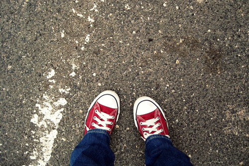
Burnt Sienna, one of the enigmatic brown crayons, was last week’s color for the sixty-four colors project. I had a few back up options in mind, but then I saw that my fellow group members were bringing their A games… and resolved to look a little harder. And lo and behold, I found some burnt sienna in the parking lot at Lowe’s, where the white parking lot lines had turned rusty thanks to the nearby rusty shopping cart corral. I did not find nearly as much burnt sienna in the archives, but I found some close ones all the same. I love how this project makes me look at things with new eyes.
Category Archives: photography
Indigo
Indigo is a gorgeous color, but a very tricky one, both to find and to photograph. For one, it’s remarkably close to Blue Violet. It turned out that all I found last week was the one indigo sweater I’d been saving all week to wear on the coldest day. But it’s almost perfectly matched, so it’s okay in the end.
Scarlet
Scarlet is yet another tricky color for the sixty-four colors project, because it’s a really nice reddish orange, but my mental image of scarlet is a much more vivid, deep red. I thought I wasn’t going to find any good shots to match the ones from the archives that I really love, but an impromptu photo walk around my apartment building turned up scarlet right outside my door!
Carnation Pink
Carnation pink came around in sixty-four colors just in time for cherry blossoms, and even though I still can’t stop taking pictures of cherry blossoms, I didn’t want to make a cherry blossom shot my official posted-to-the-group shot this week. But I found a lot of carnation pink in the archives, and seeing it all together is exactly why this project is so damn much fun.
Periwinkle
Periwinkle has been one of the harder colors for sixty-four colors so far, and serendipity wasn’t really on my side too much two weeks ago when this was the color. I found some, but they’re not quite the perfect light purpley blue shade. I like the collection of pale purple photos anyway, though.
Yellow Green
Yellow Green is the perfect color to be looking for as spring is just approaching full force. And it’s a very vivid one if you get it in the right light.
Peach
Last week’s color for the sixty-four colors project was peach. And it was tough. (Maybe I made it more difficult because I didn’t want to go with flowers.) I don’t have a single peach-colored thing in my apartment, but I found some in an unexpected location at my parents’ house. The others are some happy photos from the archives.
Asparagus
The color last week for sixty-four colors was asparagus, and I won’t lie, I had a little trouble with this one. I have a very strong image in my mind of what asparagus looks like, and I just wasn’t seeing it, not until I noticed some of the mold growing on my grandmother’s deck. Is that weird, posting a photo of mold? Well, it’s just the right shade, so I’m going with it. The other shots are from the archive, and they seem like a decent match. This is one color that it’s very easy to be super nitpicky with, so I’m not 100% satisfied. But they are all definitely in the asparagus family, so there you go. (Man, do I love this project.)
Robin's Egg Blue
Last week’s color for sixty-four colors was robin’s egg blue (another 1993 addition; I guess 1993 was a big year for new colors!). This is one of my favorite colors lately, or as close to the turquoisey aqua that is so cool. The color of the crayon is a tough one to match, but I managed to find it in a few places last week. I found a lot of robin’s egg blue in my archives, and you KNOW I’ve been waiting to go back to some Bermuda shots for this project since it started.
Brick Red
Brick red has always been one of my favorite crayons. I was surprised, though, that all of the bricks I encountered this week weren’t quite brick red-y enough. The first two are shots I got this week; the rest are just some favorites.


